Material Composition and Visual Weight
The foundation of any great plaque is its base material. The choice of substrate dictates the entire 'vibe' of the award. Wood remains the gold standard for traditional, warm, and prestigious recognition. When selecting wood, consider the grain and color: walnut offers a dark, sophisticated look suitable for executive honors, while oak or cherry provides a classic, timeless feel. For a more modern or high-tech aesthetic, acrylic and glass are superior choices. Acrylic plaques provide a sleek, contemporary edge and can play beautifully with light, making them ideal for creative industries or tech-forward organizations. If you are looking for something that feels substantial and heavy, solid wood or high-density composite bases are preferable to hollow or lightweight alternatives.
The Importance of Inlay and Plate Quality
The 'face' of the plaque—where the text is actually located—is where the details matter most. You will typically choose between metal plates, direct engraving, or printed finishes. Metal plates (often in brass, silver, or gold tones) provide a classic, layered look that adds physical depth to the award. However, ensure the metal is thick enough to avoid warping. For a seamless, ultra-modern appearance, direct laser engraving on wood or sandblasting on glass offers a high-end, integrated look where the text becomes part of the material itself. Pay close attention to the contrast. A dark plate with light lettering is much easier to read from a distance than a low-contrast combination.
Size, Scale, and Display Intent
Before finalizing your purchase, consider where the award will actually live. A small, desktop-sized plaque is perfect for individual workspaces or office desks, providing a subtle but constant reminder of success. However, for a stage presentation or a wall-mounted gallery of honor, you will need a larger format to ensure the recipient and the audience can clearly see the inscription. A plaque that is too small for its frame can look underwhelming, while one that is too large for a desk can feel intrusive. Always measure the intended display area to ensure the proportions feel intentional rather than accidental.
Customization and Typography
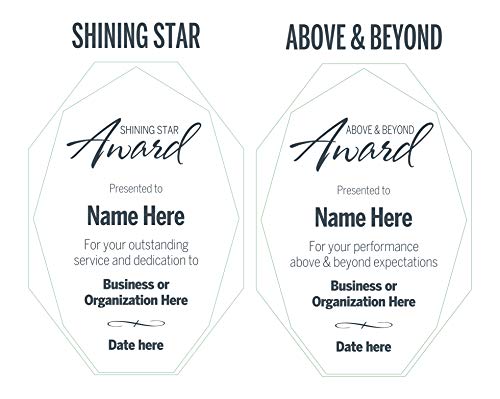
The text is the soul of the plaque. When customizing, avoid overcrowding the design. A common mistake is trying to fit too much biographical information onto a single plate, which results in tiny, unreadable fonts. Stick to the essentials: the recipient's name, the specific achievement, the date, and the issuing organization. Regarding typography, use serif fonts (like Times New Roman) for a traditional, formal feel, and sans-serif fonts (like Helvetica) for a clean, modern look. Ensure the font weight is sufficient. Extremely thin lines can disappear when engraved into certain materials like dark wood or frosted glass.
Durability and Long-Term Preservation
An award is intended to last for decades. If the plaque is intended for a trophy case or a high-traffic office, ensure the finish is resistant to fingerprints and dust. Wood should be treated with a protective sealant to prevent cracking due to humidity changes, and metal plates should be coated to prevent tarnishing over time. If you are selecting an acrylic or glass option, ensure the edges are polished to prevent chipping and to maximize light refraction.