Understanding Printmaking Techniques
The first step in selecting a handmade print is understanding the method used to create it, as the technique dictates the visual texture and 'feel' of the piece. Linocut and woodblock prints are popular for their bold, graphic qualities. Because the artist carves directly into a block, you will often see organic grain patterns and slightly irregular edges that prove the piece was pressed by hand. Screenprints, on the other hand, offer flatter, more saturated areas of color, making them ideal for modern or pop-art aesthetics. If you prefer something more delicate and intricate, look for etchings or lithographs, which allow for fine lines and complex shading. Knowing these methods helps you match the 'energy' of the print to the architecture of your room.
Evaluating Paper Quality and Weight
In the world of handmade art, the substrate is just as important as the ink. A high-quality print should be executed on acid-free, archival-grade paper. This is not just a technicality. It is a necessity for longevity. Low-quality paper will yellow, become brittle, and fade when exposed to ambient light. When browsing, look for descriptions mentioning 'heavyweight cotton rag' or 'fine art paper.' These materials have a distinct tooth (texture) that catches the light and gives the print a premium, three-dimensional quality. A print on thick, textured paper will feel like a substantial object rather than a mere sheet of stationery.
The Value of 'Artist Proofs' and Editions
One of the primary benefits of buying handmade prints is the ability to own an editioned work. Most serious printmakers will sign and number their work (e.g., 5/50). The first number represents the specific print in the sequence, while the second is the total number of prints in that run. A smaller edition size generally implies higher exclusivity and value. Additionally, keep an eye out for 'Artist Proofs' (APs). These are prints pulled outside the standard numbered edition, often used by the artist for personal collections. While they may carry a slightly higher price point, they represent a more intimate connection to the artist's process.
Assessing Color Depth and Ink Application
Because these prints are handmade, the application of ink is rarely perfectly uniform, and that is precisely where the charm lies. When inspecting a print, look for 'ink squash'—the slight buildup of ink at the edges of a carved line—which is a hallmark of a manual press. Check for color saturation. A high-quality handmade print should have a depth of color that feels embedded in the paper rather than sitting thinly on top of it. If the colors look washed out or the gradients appear muddy, it may be a sign of poor ink quality or an inconsistent pressing technique.
Framing and Presentation Considerations
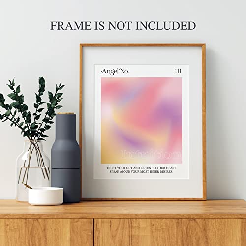
Finally, consider how the print will be presented. Because handmade prints are often textured, they should never be framed tightly against the glass. This can cause the ink to stick to the glazing over time and flattens the beautiful texture of the paper. Always look for prints that can be framed with a 'mat' or 'mount.' This creates a physical gap between the art and the glass, allowing the piece to breathe and ensuring that the archival integrity of the work is maintained for years to come.