Define Your Theme and Aesthetic First
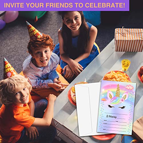
The most common mistake in event planning is choosing an invitation based on a single design element without considering the cohesive theme of the party. Before you commit to a design, visualize the atmosphere you want to create. A whimsical, pastel-colored invitation suggests a soft, daytime celebration, whereas deep jewel tones and metallic accents signal a sophisticated evening affair. If your party has a specific motif—such as celestial patterns, floral arrangements, or retro geometric shapes—ensure the invitation's visual language aligns perfectly. The color palette of your invitations should ideally serve as the blueprint for your table settings, balloons, and overall decor.
Evaluate Paper Quality and Texture
The tactile experience of an invitation is just as important as its visual appeal. When reviewing options, pay close attention to the weight and finish of the cardstock. A flimsy, thin paper can make a high-end event feel cheap or rushed. Look for heavyweight cardstock that feels substantial in the hand and resists bending during transit. Furthermore, consider the finish: a matte finish offers a modern, elegant, and non-reflective look that is easy to read under various lighting, while a glossy finish can make colors pop and provide a vibrant, high-energy feel. If you are looking for a premium touch, seek out textures that mimic linen or recycled fibers, which add a layer of sophistication and sensory interest.
Prioritize Legibility and Layout
An invitation fails its primary purpose if guests cannot easily discern the essential details. A beautiful design is useless if the font is too ornate or the color contrast is too low to read. When selecting your invitations, perform a quick 'readability test.' Can you clearly see the date, time, location, and RSVP instructions at a glance? Avoid designs where the background pattern competes too aggressively with the text. The layout should have a logical flow, guiding the eye from the headline (the 'what') to the logistical details (the 'when' and 'where'). Ensure there is ample white space or 'breathing room' around the text to prevent the card from looking cluttered.
Consider the Logistics of Customization
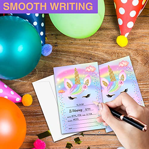
Modern invitation sets vary significantly in how much control you have over the final product. Some sets come with pre-printed text that requires you to work around existing wording, while others offer blank spaces or customizable templates. If you have a unique venue or specific RSVP instructions (such as a QR code or a specific website), ensure the invitation format allows for that flexibility. Additionally, consider the quantity. It is always wise to order a small surplus to account for last-minute additions to your guest list or to keep as keepsakes. Always check if the set includes matching envelopes, as a mismatch in color or size can disrupt the professional look of your stationery suite.
The Decision Logic: Matching Occasion to Investment
When making your final selection, use this logic: For formal events like weddings or milestone anniversaries, prioritize heavy cardstock and minimalist, elegant typography. For casual gatherings like birthdays or seasonal parties, prioritize bold colors, playful illustrations, and high-energy themes. If you are on a tight timeline, look for designs that are easy to personalize quickly without sacrificing the visual impact of the event.