Define Your Cartographic Theme
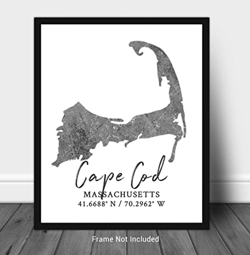
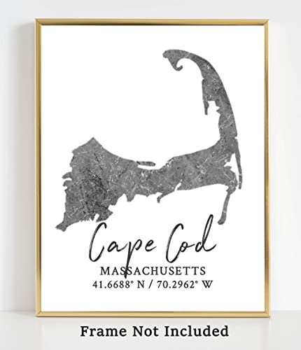
The first decision factor is the thematic direction of the map. Westbrook Design Studio offers a diverse range of styles, from vintage-inspired historical renderings to sleek, modern minimalist designs. If you are looking to create a sense of nostalgia or a 'study' atmosphere, look for maps that utilize aged color palettes—sepia tones, muted ochres, and deep teals. These work exceptionally well in rooms with dark wood furniture or leather accents. Conversely, if your decor is contemporary or Scandinavian in style, opt for high-contrast, minimalist maps that emphasize clean lines and whitespace. The theme should complement your existing color story rather than fight against it.
Scale and Spatial Proportions
A common mistake in wall art selection is choosing a scale that is either too diminutive for the wall or too overwhelming for the room. When evaluating a print, consider the 'visual weight' of the map. A highly detailed world map with intricate topographical shading carries significant visual weight and requires a larger expanse of wall to breathe. If you are decorating a narrow hallway or a small nook, consider focused regional maps—such as a specific coastline or a single continent—rather than a global view. This allows for greater detail in a smaller footprint without making the space feel cramped.
Paper Quality and Print Fidelity
Since these are high-end prints, the tactile and visual quality of the medium is paramount. Look for descriptions that emphasize heavy-weight archival paper. High-quality paper prevents warping over time and ensures that the ink saturation remains consistent across the entire surface. When reviewing the print fidelity, pay close attention to the legibility of the typography. A premium map should maintain crisp, sharp text even at the smallest scales. If the text appears blurry or the color gradients look 'banded,' the print may lack the resolution necessary for a professional display. The goal is a piece that looks as good from six inches away as it does from six feet away.
Framing and Presentation Strategy
A map print is only half of the final product. The framing is what transforms it into a piece of fine art. Because Westbrook Design Studio maps often feature intricate details, consider the frame's impact on the viewer's focus. A thick, ornate frame can add a sense of historical importance but may distract from the map's fine lines. A slim, matte black or natural wood frame provides a modern, unobtrusive border that directs all attention to the cartography. Additionally, consider whether you want a mat board. A wide white mat can provide a 'gallery feel' and prevent the paper from touching the glass, which is vital for long-term preservation.
Recommendation Logic
To make your final selection, use this logic: If your goal is Atmosphere, prioritize vintage styles and warm tones. If your goal is Intellectual Focus, prioritize high-detail topographical maps. If your goal is Minimalist Decor, prioritize monochromatic or single-color schemes. Always match the scale of the map to the scale of the furniture below it to maintain visual equilibrium in your room.