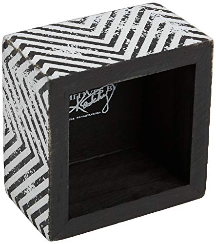
Understanding the Primitive Aesthetic
The first step in selecting a decorative plaque is understanding what makes a piece truly 'primitive.' Unlike modern decor that favors high-gloss finishes and sharp lines, primitive style relies on intentional imperfection. Look for signs of distressing—areas where the paint appears slightly rubbed away to reveal the wood beneath, or edges that look softened by time. The color stories should be earthy: creams, deep burgundies, forest greens, and charcoal grays. When browsing, ask yourself if the piece feels like an heirloom found in an attic or a piece of history rediscovered. If a plaque looks too 'perfect' or shiny, it may clash with the rustic atmosphere you are trying to cultivate.
Material and Texture Matters
The tactile quality of a plaque significantly impacts its visual weight in a room. Most high-quality decorative signs utilize natural wood bases, which provide a sturdy, authentic feel. Pay attention to the texture of the surface. Some plaques feature a smooth, painted finish that mimics aged linen, while others may have a more rugged, reclaimed wood texture. Texture plays a massive role in how light hits the object. A heavily textured plaque will cast subtle shadows, adding depth to a shelf or mantle, whereas a smoother plaque works better for layered arrangements where you don't want the decor to feel too 'busy.'
Scale and Placement Strategy
One of the most common mistakes in home styling is choosing a plaque that is either too small for its intended space or too large for its surroundings. A small, sentimental kitchen sign can get lost on a massive dining room sideboard, whereas a large, statement-making porch plaque might overwhelm a narrow entryway.
When planning your purchase, consider the 'cluster effect.' Primitive decor often looks best when grouped together in varying sizes. If you are building a gallery wall, look for a variety of shapes—rectangular, oval, or even irregular silhouettes. If you are looking for a single focal point, prioritize a plaque with bold typography or a central motif that commands attention. Always measure your intended hanging space before committing to a size to ensure the plaque breathes within its environment.
Thematic and Seasonal Versatility
Decide whether you want a permanent fixture or a seasonal accent. Primitives by Kathy offers a wide range of themes, from evergreen farmhouse sentiments that work year-round to highly specific seasonal motifs. For a timeless look, opt for themes centered around home, family, or hospitality (e.g., 'Gather,' 'Kitchen,' or 'Home Sweet Home'). These pieces integrate seamlessly into your daily life. However, if you enjoy rotating your decor, look for plaques that feature seasonal elements like autumn leaves, spring florals, or winter motifs. These allow you to refresh your home's energy without a complete overhaul of your decor style.
Final Decision Logic
To make the best choice, use this quick checklist: Does the color palette complement my existing wood tones? Is the distressing level appropriate for my room's lighting? Does the sentiment resonate with the specific room it will inhabit? By focusing on texture, scale, and thematic longevity, you will select a piece that doesn't just decorate a wall, but adds genuine warmth and character to your living space.