Understanding the Primitive Aesthetic
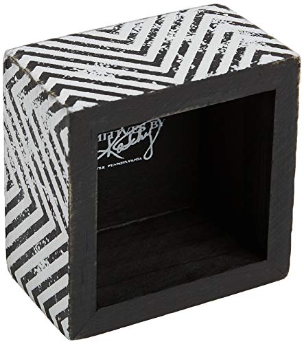
The hallmark of a true Primitives by Kathy piece is its 'distressed' quality. When browsing plaques, you aren't looking for perfection. You are looking for intentional character. Look for signs of simulated age, such as sanded edges, faux-cracked paint, and muted, earthy color palettes. A high-quality plaque in this category should feel substantial. Avoid pieces that look overly shiny or digitally printed with high-gloss finishes, as these detract from the rustic, heirloom feel. Instead, prioritize matte finishes and textures that mimic reclaimed wood, weathered metal, or aged parchment.
Material Composition and Durability
Decorative plaques come in various media, and your choice should depend heavily on where you intend to hang them. Wood-based plaques are the gold standard for this style, offering a weight and grain that plastic or MDF alternatives cannot replicate. If you are decorating a high-traffic area like a kitchen or a mudroom, look for reinforced wood or composite materials that can withstand minor bumps. For outdoor-adjacent areas like a covered porch, ensure the plaque features weather-resistant coatings, though keep in mind that most decorative primitive plaques are designed primarily for interior use to preserve their delicate, distressed finishes.
Theme and Seasonal Versatility
One of the most important decision factors is whether you want a perennial piece or a seasonal accent. Primitives by Kathy excels in both. For year-round decor, focus on 'neutral primitives'—plaques featuring botanical sketches, simple farmhouse typography, or classic motifs like crows, barns, or sunflowers. These pieces blend into a home without demanding constant rotation. Conversely, if you are building a seasonal display, look for theme-specific plaques that utilize color cues: deep oranges and muted browns for autumn, soft pastels and floral motifs for spring, or cozy, hearth-centered imagery for winter. A common mistake is buying too many highly specific seasonal pieces, which can clutter a room. Instead, mix one or two statement seasonal plaques with several timeless, neutral pieces.
Scale, Proportion, and Display Logic
Before committing to a plaque, consider its physical dimensions relative to your wall space. A small, 6-inch plaque can look lost on a large dining room wall, but it becomes a charming accent on a tiered tray or a bookshelf. Conversely, a large-scale statement plaque needs breathing room to be appreciated. When shopping, think in 'collections.' Primitives by Kathy pieces often work best when grouped in odd numbers (threes or fives) or layered with other textures like burlap, woven baskets, or ironstone pitchers. If you plan to hang a plaque as a centerpiece, ensure it has a sturdy, integrated hanging mechanism—preferably one that allows it to sit flush against the wall to maintain that authentic, mounted look.
Final Recommendation Logic
To make the best purchase, follow this hierarchy: First, define your location (Kitchen vs. Living Room). Second, choose your intent (Seasonal vs. Evergreen). Third, inspect the texture (Matte and Distressed vs. Smooth and New). If a plaque passes these three tests, it will likely become a beloved staple in your home decor collection.