Evaluate the Material and Texture
The foundation of any high-quality plaque is the substrate used. SJT Enterprises offers a variety of finishes, and your choice should depend heavily on the environment where the sign will live. For high-traffic areas like hallways or commercial lobbies, look for plaques with hard-wearing surfaces that resist scuffing and moisture. If you are aiming for a rustic or farmhouse aesthetic, wood-grain textures or matte finishes provide a warmth that polished surfaces lack. Conversely, for a modern or executive look, sleek, smooth finishes with a slight sheen can elevate a professional space. Always consider how the light in your room will hit the surface. A highly reflective plaque might cause glare under bright LED lighting, making text difficult to read.
Consider Legibility and Typography
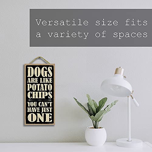
A plaque is a medium for communication, whether it is displaying a name, a motivational quote, or directional information. The most common mistake in selecting decorative signs is prioritizing artistic flair over readability. When reviewing different designs, check the contrast between the lettering and the background. High-contrast pairings—such as dark lettering on a light base—are essential for accessibility. Pay close attention to the font style: serif fonts often convey a sense of tradition and elegance, making them ideal for commemorative plaques, while sans-serif fonts feel contemporary and are much easier to read from a distance. Ensure the scale of the text is proportionate to the plaque size. If the text is too small relative to the border, the sign will feel unbalanced.
Match the Aesthetic to the Setting
Before finalizing your purchase, visualize the plaque within its intended context. A decorative plaque intended for a kitchen or dining area should feel organic and inviting, perhaps utilizing softer color palettes. For an office or workspace, the design should lean toward structured, geometric, and authoritative styles. Consider the 'visual weight' of the plaque. A heavy, dark-bordered plaque will command attention and may require a larger wall to avoid looking cluttered, whereas a minimalist, thin-framed design can blend seamlessly into a gallery wall or a subtle corner accent.
Mounting and Installation Requirements
The longevity of your decorative sign depends heavily on how it is secured to the wall. Determine if the plaque is designed for flush mounting, which provides a seamless, integrated look, or if it features stand-off hardware that allows it to hover slightly off the wall, creating a sense of depth and dimension. If you are renting or working with delicate surfaces like plaster, look for lightweight options that can be secured with adhesive strips rather than heavy-duty drilling. Understanding the weight of the material—be it dense composite or lightweight synthetic—will dictate the tools and hardware you need to ensure the sign remains level and secure over time.