Defining Your Aesthetic Direction
The first step in selecting a print is identifying the dominant theme of your room. Stupell Industries is known for its versatility, which can actually lead to decision paralysis. If you are decorating a nursery, you might lean toward their softer, illustrative, or animal-themed prints. For a sophisticated home office, you may want to search for geometric patterns or minimalist line art. A common mistake is choosing a print based solely on a single color you like, without considering the 'vibe.' Consider whether your space needs a 'statement piece'—a large, high-contrast print that commands attention—or 'accent pieces'—smaller, cohesive prints that work together to create a gallery wall. If you are building a gallery wall, ensure the themes are loosely related (e.g., all vintage botanical or all monochrome) to prevent the room from looking cluttered.
Understanding Print Mediums and Materials
Not all prints are created equal, and the material of the art significantly impacts both the visual depth and the longevity of the piece. When browsing, you will encounter several distinct formats:
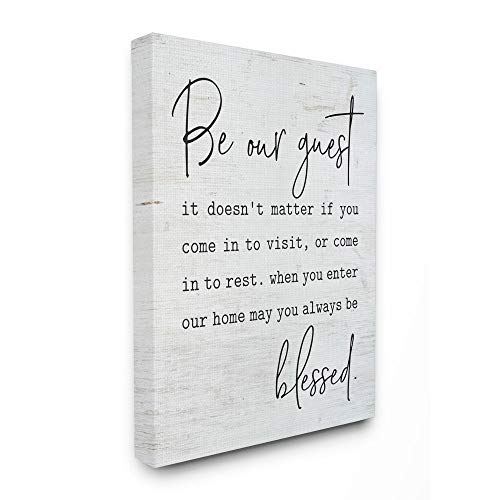
- Canvas Prints: These are ideal for those seeking a traditional 'gallery' look. The texture of the canvas adds a layer of sophistication and eliminates the glare often found in glass-framed art. Canvas is excellent for living rooms and bedrooms where you want a soft, textured feel.
- Framed Prints: These provide a more structured, polished appearance. A framed print often comes ready to hang, making it a convenient choice for quick decor updates. The frame acts as a border that separates the art from the wall, adding a sense of intentionality.
- Unframed/Poster Style: These are often more budget-friendly and offer the most flexibility. If you already own high-quality frames or prefer a specific custom framing style, purchasing unframed prints allows you to tailor the presentation exactly to your taste.
Scale, Proportion, and Placement
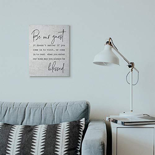
One of the most frequent errors in home styling is selecting art that is too small for the wall it occupies. A tiny print on a massive, empty wall will look lost and diminish the perceived quality of the room. As a rule of thumb, art should occupy roughly two-thirds to three-quarters of the available wall space above a piece of furniture, such as a sofa or a sideboard. If you are working with a small space, consider vertical orientation to draw the eye upward and create the illusion of higher ceilings. Conversely, large horizontal landscapes are perfect for centering over a bed or a dining table to ground the room.
Durability and Lighting Considerations
When selecting your art, consider the environment where it will live. For high-traffic areas like hallways or sunrooms, canvas is often more resilient to humidity and physical contact. Furthermore, pay attention to your lighting. If a room receives heavy, direct sunlight, matte finishes or canvas textures are preferable to glossy prints, which can create distracting reflections. When choosing between different styles, think about how the colors will react to your room's light temperature—warm lighting will enhance earthy tones, while cool, bright light will make vibrant, modern colors pop.