Identify Your Core Aesthetic Theme
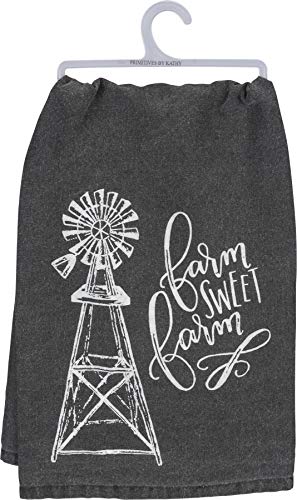
The Primitives by Kathy brand is renowned for its distinct visual storytelling. Before purchasing, determine which specific sub-style of rustic decor you are aiming for. Some towels feature heavy, weathered typography and muted, desaturated tones that fit perfectly in a 'primitive country' setting. Others may lean more toward a whimsical, floral, or seasonal aesthetic. If your kitchen uses a lot of reclaimed wood and wrought iron, look for towels with darker, earthier tones and distressed patterns. If your space is more light and airy, seek out designs with cream backgrounds and delicate, folk-art inspired botanical prints. Matching the 'mood' of the print to the 'mood' of your hardware is essential for a cohesive look.
Evaluate Fabric Texture and Weight
In the world of decorative hand towels, texture is just as important as pattern. Because these towels are often displayed hanging on rings or over oven handles, the way the fabric drapes matters significantly. Heavier, more substantial cotton blends tend to hang straight and hold their shape, making them ideal for permanent display. Lighter, more textured weaves—such as those mimicking linen or featuring subtle jacquard patterns—add a layer of tactile interest to your space. If you plan to use the towels frequently for drying hands, prioritize a medium-weight cotton that offers absorbency without feeling overly stiff or abrasive. For purely decorative purposes, you can opt for thinner fabrics that allow the intricate printed details to remain the focal point.
Consider Seasonal vs. Year-Round Utility
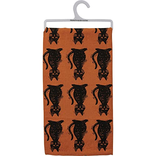
One of the most common mistakes in home styling is over-committing to a single seasonal motif. The Primitives by Kathy collection often releases highly specific seasonal designs, ranging from autumn harvests to springtime florals. To build a versatile linen closet, we recommend a 'Core and Accent' strategy. Invest in a few 'Core' towels that feature timeless, neutral motifs—such as simple stripes, subtle textures, or classic farmhouse typography—that can stay on display year-round. Then, supplement these with 'Accent' towels that reflect the current season. This allows you to refresh your home's atmosphere with minimal effort and prevents your decor from feeling dated when the seasons change.
Color Coordination and Palette Integration
When selecting your towels, look beyond the primary color of the print and consider the secondary and tertiary tones. A towel might appear to be a simple red, but it may contain hints of sage green, cream, or charcoal. These smaller color details are what allow a towel to 'talk' to other elements in your room, such as your backsplash tiles, dishcloths, or even your window treatments. For a sophisticated look, choose towels that incorporate at least one color already present in your room. For a more eclectic, maximalist farmhouse look, don't be afraid to mix patterns, provided they share a similar color temperature (e.g., all warm tones or all cool tones).
Maintenance and Longevity
Since many of these towels feature intricate prints and specialized washes to achieve that 'primitive' look, care is paramount. To maintain the integrity of the colors and the softness of the fabric, avoid high-heat drying cycles which can cause the printed elements to crack or fade prematurely. We recommend washing in cool to lukewarm water and using mild detergents. This ensures that the charm of your Primitives by Kathy collection lasts through many seasons of use.